| 123456789101112131415161718192021222324252627282930313233343536373839404142434445464748495051525354555657585960616263646566676869707172737475767778798081828384858687888990919293949596979899100101102103104105106107108109110111112113114115116117118119120121122123124125126127128129130131132133134135136137138139140141142143144145146147148149150151152153154155156157158159160161162163164165166167168169170171172173174175176177178179180181182183184185186187188189190191192193194195196197198199200201 |
- ---
- title: "Interact with charts"
- description: "Learn how to pan, zoom, select, and customize Netdata's preconfigured charts to help you troubleshooting with real-time, per-second metrics data."
- type: "how-to"
- custom_edit_url: "https://github.com/netdata/netdata/edit/master/docs/dashboard/interact-charts.mdx"
- sidebar_label: "Interact with charts"
- learn_status: "Published"
- learn_topic_type: "Tasks"
- learn_rel_path: "Operations"
- ---
- # Interact with charts
- > ⚠️ There is a new version of charts that is currently **only** available on [Netdata Cloud](https://github.com/netdata/netdata/blob/master/docs/cloud/visualize/interact-new-charts.md). We didn't
- > want to keep this valuable feature from you, so after we get this into your hands on the Cloud, we will collect and implement your feedback to make sure we are providing the best possible version of the feature on the Netdata Agent dashboard as quickly as possible.
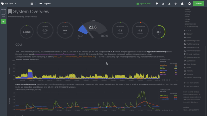
- While charts that update every second with new metrics are helpful for understanding the immediate state of a node, deep
- troubleshooting and root cause analysis begins by manipulating the default charts. To help you troubleshoot, Netdata
- synchronizes every chart every time you interact with one of them.
- Here's what synchronization looks like:
- 
- Once you understand all the interactions available to you, you'll be able to quickly move around the dashboard, search
- for anomalies, and find root causes using per-second metrics.
- ## Pause or stop
- | Interaction | Keyboard/mouse | Touchpad/touchscreen |
- | :---------------- | :------------- | :------------------- |
- | **Pause** a chart | `hover` | `n/a` |
- | **Stop** a chart | `click` | `tap` |
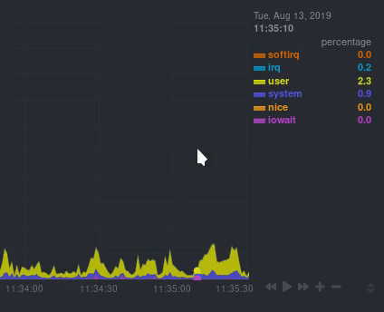
- By hovering over any chart, you temporarily pause it so that you can hover over a specific timeframe and see the exact
- values presented as dimensions. Click on the chart to lock it to this timeframe, which is useful if you want to jump to
- a different chart to look for possible correlations.
- 
- ## Pan
- | Interaction | Keyboard/mouse | Touchpad/touchscreen |
- | :---------- | :------------- | :------------------- |
- | **Pan** | `click + drag` | `swipe` |
- Drag your mouse/finger to the right to pan backward through time, or drag to the left to pan forward in time. Think of
- it like pushing the current timeframe off the screen to see what came before or after.
- ## Zoom
- | Interaction | Keyboard/mouse | Touchpad/touchscreen |
- | :------------------------------- | :-------------------------- | :--------------------------------------------------- |
- | **Zoom** in or out | `Shift + mouse scrollwheel` | `two-finger pinch` <br />`Shift + two-finger scroll` |
- | **Zoom** to a specific timeframe | `Shift + mouse selection` | `n/a` |
- Zooming in helps you see metrics with maximum granularity, which is useful when you're trying to diagnose the root cause
- of an anomaly or outage. Zooming out lets you see metrics within the larger context, such as the last hour, day, or
- week, which is useful in understanding what "normal" looks like, or to identify long-term trends, like a slow creep in
- memory usage.
- ## Select
- | Interaction | Keyboard/mouse | Touchpad/touchscreen |
- | :------------------------------ | :-------------------------------------------------------- | :------------------- |
- | **Select** a specific timeframe | `Alt + mouse selection` or `⌘ + mouse selection` (macOS) | `n/a` |
- Selecting timeframes is useful when you see an interesting spike or change in a chart and want to investigate further.
- Select a timeframe, then move to different charts/sections of the dashboard. Each chart shows the same selection to help
- you immediately identify the timeframe and look for correlations.
- ## Reset a chart to its default state
- | Interaction | Keyboard/mouse | Touchpad/touchscreen |
- | :---------------- | :------------- | :------------------- |
- | **Reset** a chart | `double-click` | `n/a` |
- Double-check on a chart to restore it to the default auto-updating state, with a timeframe based on your browser
- viewport.
- ## Resize
- Click-and-drag the icon on the bottom-right corner of any chart. To restore the chart to its original height,
- double-click the same icon.
- 
- ## Show and hide dimensions
- | Interaction | Keyboard/mouse | Touchpad/touchscreen |
- | :------------------------------------- | :-------------- | :------------------- |
- | **Show one** dimension and hide others | `click` | `tap` |
- | **Toggle (show/hide)** one dimension | `Shift + click` | `n/a` |
- Hiding dimensions simplifies the chart and can help you better discover exactly which aspect of your system might be
- behaving strangely.
- ## See the context
- Hover your mouse over the date that appears just beneath the chart itself. A tooltip will tell you the context for that
- chart. Below, the context is `apps.cpu`.
- 
- ## See the resolution and update frequency
- Hover your mouse over the timestamp just to the right of the date. `resolution` is the number of seconds between each
- "tick" in the chart. `collection every` is how often Netdata collects and stores that metric.
- If the `resolution` value is higher than `collection every`, such as `resolution 5 secs, collected every 1 sec`, this
- means that each tick is calculating represents the average values across a 5-second period. You can zoom in to increase
- the resolution to `resolution 1 sec` to see the exact values.
- ## Chart controls
- Many of the above interactions can also be triggered using the icons on the bottom-right corner of every chart. They
- are, respectively, `Pan Left`, `Reset`, `Pan Right`, `Zoom In`, and `Zoom Out`.
- ## Chart label filtering
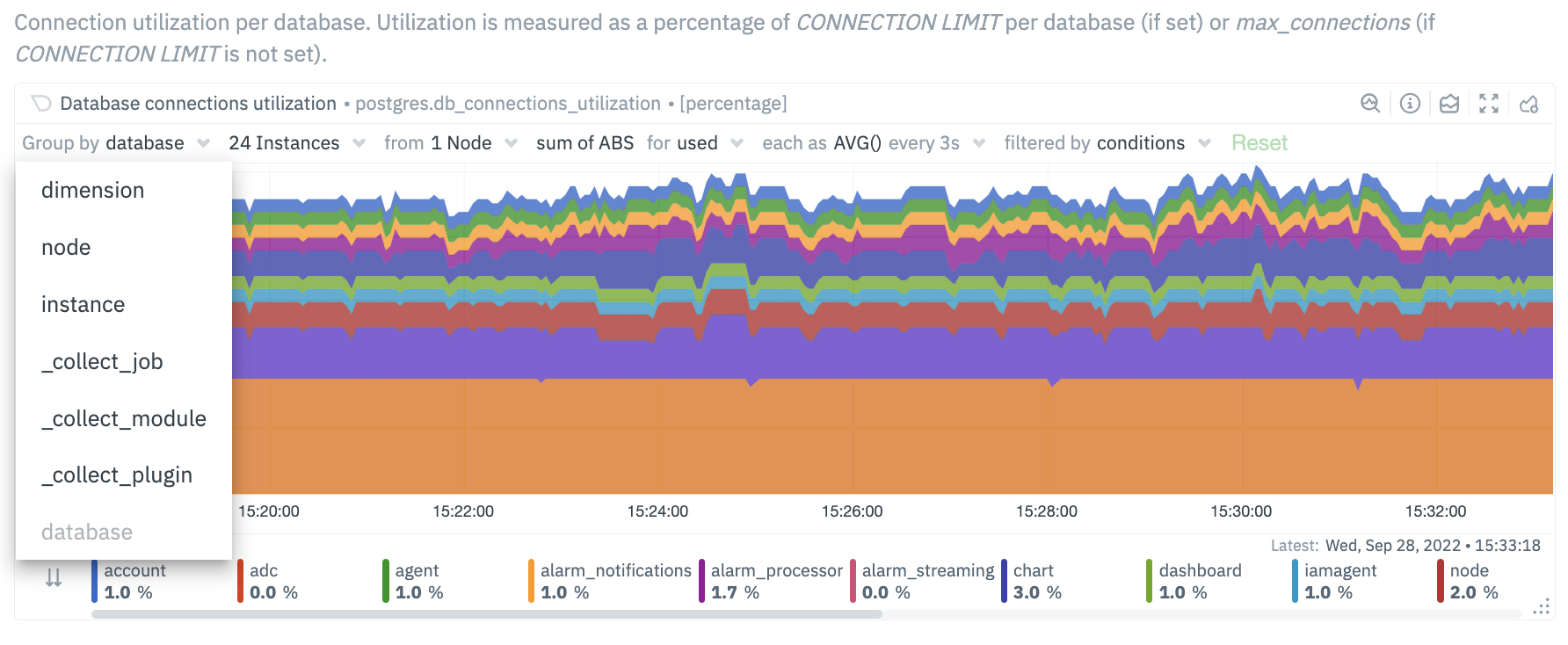
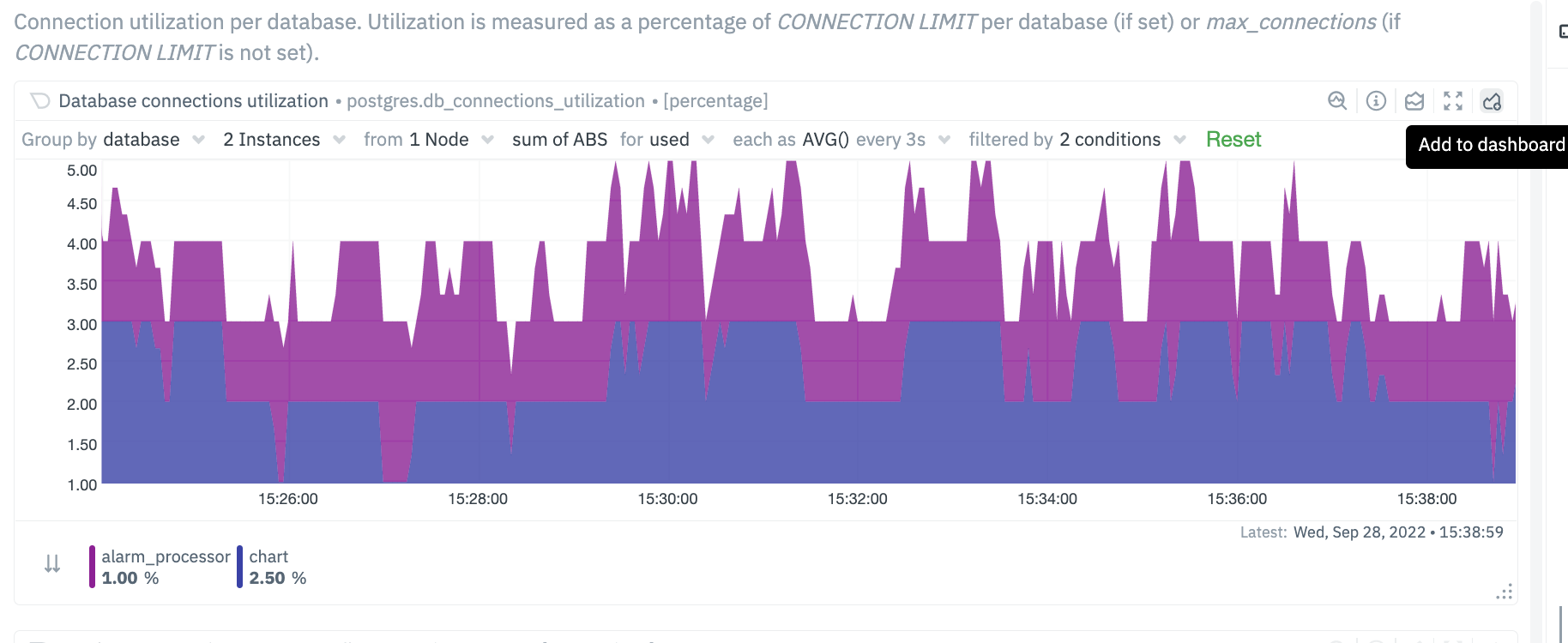
- The chart label filtering feature supports grouping by and filtering each chart based on labels (key/value pairs) applicable to the context and provides fine-grain capability on slicing the data and metrics.
- All metrics collected get "tagged" with labels and values, thus providing a powerful way of slicing and visualizing all metrics related to the infrastructure.
- The chart label filtering is currently enabled on:
- - All charts on the **Overview** tab
- - Custom dashboards
- 
- 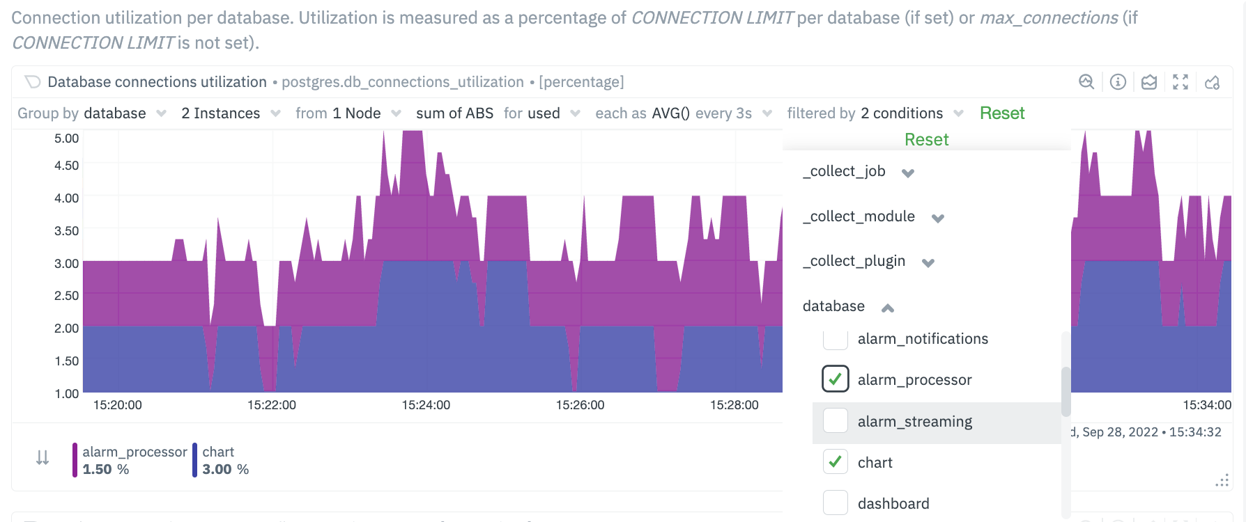
- The top panel on each chart displays the various filters and grouping options selected on the specific chart. These filters are specific for each chart and need to be manually configured on each chart.
- Additionally, the charts can be saved to a custom dashboard, new or existing, with the selected filters from the overview screen.
- 
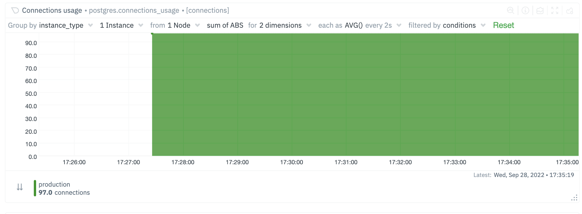
- ## Custom labels for Collectors
- In addition to the default labels associated with a collector and metrics context (you can identify them by seeing which ones have an underscore as a prefix), there is now a new feature enabled to create custom labels. These custom labels may be needed to group your jobs or instances into various categories.
- These custom labels can be configured within your go.d plugins by simply associating a label key/value pair, as in the following eaxmple.
- ```conf
- jobs:
- - name: example_1
- someOption: someValue
- labels:
- label1: value1
- label2: value2
- - name: example_2
- someOption: someValue
- labels:
- label3: value3
- label4: value4
- ```
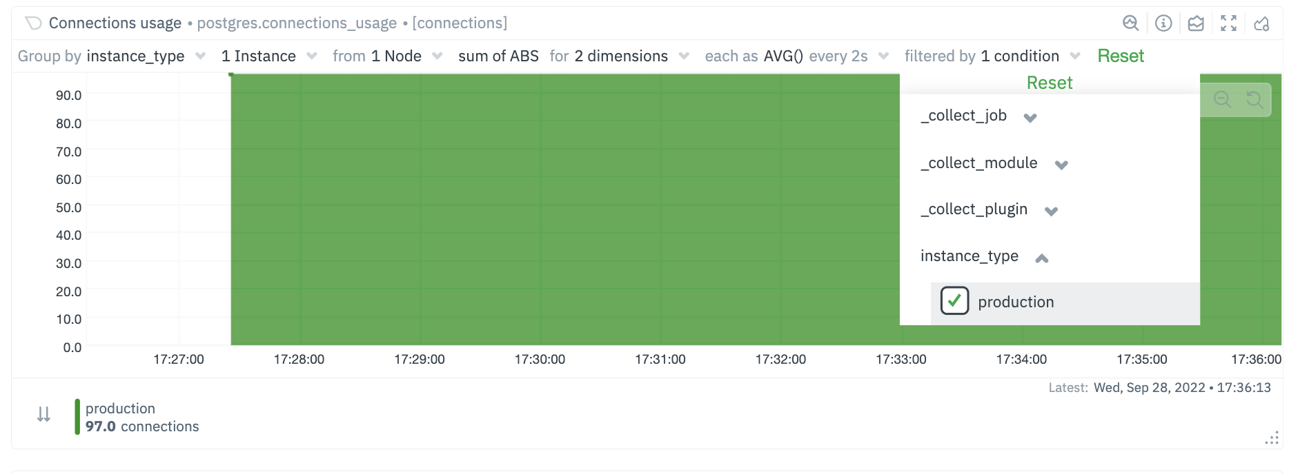
- For instance, you may be running multiple Postgres database instances within an infrastructure. Some of these may be associated with testing environments, some with staging and some with production environments. You can now associate each Postgres job / instance with a custom label. The “group by” and filtering options will then allow you to associate individual jobs by specific labels.
- ```conf
- jobs:
- - name: local
- dsn: 'postgres://postgres:postgres@127.0.0.1:5432/postgres'
- collect_databases_matching: '*'
- labels:
- instance_type: production
- ```
- 
- 
- ### Future Work
- We already have [configurable host labels](https://github.com/netdata/netdata/blob/master/docs/guides/using-host-labels.md) as well, which currently can’t be used to filter or group your metrics. We intend to provide the same capabilities described here with host labels, among other capabilities on other areas of the app as well
- ## What's next?
- We recommend you read up on the differences between [chart dimensions, contexts, and
- families](https://github.com/netdata/netdata/blob/master/docs/dashboard/dimensions-contexts-families.mdx) to complete your understanding of how Netdata organizes its
- dashboards. Another valuable way to interact with charts is to use the [timeframe
- selector](https://github.com/netdata/netdata/blob/master/docs/dashboard/visualization-date-and-time-controls.mdx), which helps you visualize specific moments of historical metrics.
- If you feel comfortable with the [dashboard](https://github.com/netdata/netdata/blob/master/docs/dashboard/how-dashboard-works.mdx) and interacting with charts, we
- recommend moving on to learning about [configuration](https://github.com/netdata/netdata/blob/master/docs/configure/nodes.md). While Netdata doesn't _require_ a
- complicated setup process or a query language to create charts, there are a lot of ways to tweak the experience to match
- your needs.
- ### Further reading & related information
- - Dashboard
- - [How the dashboard works](https://github.com/netdata/netdata/blob/master/docs/dashboard/how-dashboard-works.mdx)
- - [Netdata Cloud · Interact with new charts](https://github.com/netdata/netdata/blob/master/docs/cloud/visualize/interact-new-charts.md)
- - [Chart dimensions, contexts, and families](https://github.com/netdata/netdata/blob/master/docs/dashboard/dimensions-contexts-families.mdx)
- - [Select timeframes to visualize](https://github.com/netdata/netdata/blob/master/docs/dashboard/visualization-date-and-time-controls.mdx)
- - [Import, export, and print a snapshot](https://github.com/netdata/netdata/blob/master/docs/dashboard/import-export-print-snapshot.mdx)
- - [Customize the standard dashboard](https://github.com/netdata/netdata/blob/master/docs/dashboard/customize.mdx)
|
