| 123456789101112131415161718192021222324252627282930313233343536373839404142434445464748495051525354555657585960616263646566676869707172737475767778798081828384858687888990919293949596 |
- ---
- title: "Chart dimensions, contexts, and families"
- description: "Netdata organizes charts into dimensions, contexts, and families to automatically and meaningfully organize thousands of metrics into interactive charts."
- type: explanation
- custom_edit_url: https://github.com/netdata/netdata/edit/master/docs/dashboard/dimensions-contexts-families.mdx
- ---
- # Chart dimensions, contexts, and families
- While Netdata's charts require no configuration and are [easy to interact with](/docs/dashboard/interact-charts.mdx),
- they have a lot of underlying complexity. To meaningfully organize charts out of the box based on what's happening in
- your nodes, Netdata uses the concepts of **dimensions**, **contexts**, and **families**.
- Understanding how these work will help you more easily navigate the dashboard, [write new
- alarms](/docs/monitor/configure-alarms.md), or play around with the [API](/web/api/README.md).
- For a refresher on the anatomy of a chart, see [dashboards and charts](/docs/dashboard/how-dashboard-works.mdx).
- ## Dimension
- A **dimension** is a value that gets shown on a chart. The value can be raw data or calculated values, such as the
- average (the default), minimum, or maximum. These values can then be given any type of unit. For example, CPU
- utilization is represented as a percentage, disk I/O as `MiB/s`, and available RAM as an absolute value in `MiB` or
- `GiB`.
- Beneath every chart (or on the right-side if you configure the dashboard) is a legend of dimensions. When there are
- multiple dimensions, you'll see a different entry in the legend for each dimension.
- The **Apps CPU Time** chart (with the [context](#context) `apps.cpu`), which visualizes CPU utilization of
- different types of processes/services/applications on your node, always provides a vibrant example of a chart with
- multiple dimensions.
- 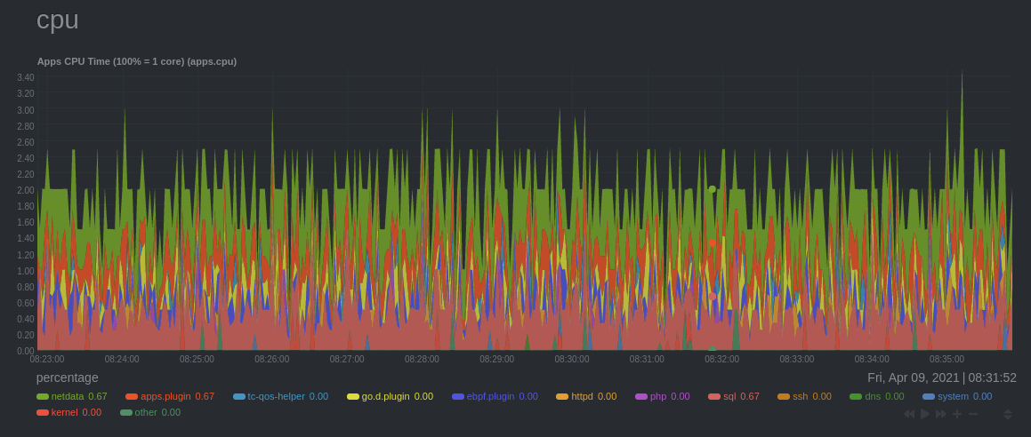
- The chart shows 13 unique dimensions, such as `httpd` for the CPU utilization for web servers, `kernel` for anything
- related to the Linux kernel, and so on. In your dashboard, these specific dimensions will almost certainly be different.
- Dimensions can be [hidden](/docs/dashboard/interact-charts.mdx#show-and-hide-dimensions) to help you focus your
- attention.
- ## Context
- A **context** is a way of grouping charts by the types of metrics collected and dimensions displayed. It's kind of like
- a machine-readable naming and organization scheme.
- For example, the **Apps CPU Time** has the context `apps.cpu`. A little further down on the dashboard is a similar
- chart, **Apps Real Memory (w/o shared)** with the context `apps.mem`. The `apps` portion of the context is the **type**,
- whereas anything after the `.` is specified either by the chart's developer or by the [**family**](#family).
- By default, a chart's type affects where it fits in the menu, while its family creates submenus.
- Netdata also relies on contexts for [alarm configuration](/docs/monitor/configure-alarms.md) (the [`on`
- line](/health/REFERENCE.md#alarm-line-on)).
- ## Family
- **Families** are a _single instance_ of a hardware or software resource that needs to be displayed separately from
- similar instances.
- For example, let's look at the **Disks** section, which contains a number of charts with contexts like `disk.io`,
- `disk.ops`, `disk.backlog`, and `disk.util`. If your node has multiple disk drives at `sda` and `sdb`, Netdata creates
- a separate family for each.
- Netdata now merges the contexts and families to create charts that are grouped by family, following a
- `[context].[family]` naming scheme, so that you can see the `disk.io` and `disk.ops` charts for `sda` right next to each
- other.
- Given the four example contexts, and two families of `sda` and `sdb`, Netdata will create the following charts and their
- names:
- | Context | `sda` family | `sdb` family |
- | :------------- | ------------------ | ------------------ |
- | `disk.io` | `disk_io.sda` | `disk_io.sdb` |
- | `disk.ops` | `disk_ops.sda` | `disk_ops.sdb` |
- | `disk.backlog` | `disk_backlog.sda` | `disk_backlog.sdb` |
- | `disk.util` | `disk_util.sda` | `disk_util.sdb` |
- ## What's next?
- With an understanding of a chart's dimensions, context, and family, you're now ready to dig even deeper into Netdata's
- dashboard. We recommend looking into [using the timeframe selector](/docs/dashboard/visualization-date-and-time-controls.mdx).
- If you feel comfortable with the [dashboard](/docs/dashboard/how-dashboard-works.mdx) and interacting with charts, we
- recommend learning about [configuration](/docs/configure/nodes.md). While Netdata doesn't _require_ a complicated setup
- process or a query language to create charts, there are a lot of ways to tweak the experience to match your needs.
- ### Further reading & related information
- - Dashboard
- - [How the dashboard works](/docs/dashboard/how-dashboard-works.mdx)
- - [Interact with charts](/docs/dashboard/interact-charts.mdx)
- - **[Chart dimensions, contexts, and families](/docs/dashboard/dimensions-contexts-families.mdx)**
- - [Select timeframes to visualize](/docs/dashboard/visualization-date-and-time-controls.mdx)
- - [Import, export, and print a snapshot](/docs/dashboard/import-export-print-snapshot.mdx)
- - [Customize the standard dashboard](/docs/dashboard/customize.mdx)
|
