
anomaly-detection.md 6.6 KB
Machine learning (ML) powered anomaly detection
Overview
As of v1.32.0, Netdata comes with some ML powered anomaly detection capabilities built into it and available to use out of the box, with zero configuration required (ML was enabled by default in v1.35.0-29-nightly in this PR, previously it required a one line config change).
This means that in addition to collecting raw value metrics, the Netdata agent will also produce an anomaly-bit every second which will be 100 when recent raw metric values are considered anomalous by Netdata and 0 when they look normal. Once we aggregate beyond one second intervals this aggregated anomaly-bit becomes an "anomaly rate".
To be as concrete as possible, the below api call shows how to access the raw anomaly bit of the system.cpu chart from the london.my-netdata.io Netdata demo server. Passing options=anomaly-bit returns the anomaly bit instead of the raw metric value.
https://london.my-netdata.io/api/v1/data?chart=system.cpu&options=anomaly-bit
If we aggregate the above to just 1 point by adding points=1 we get an "Anomaly Rate":
https://london.my-netdata.io/api/v1/data?chart=system.cpu&options=anomaly-bit&points=1
The fundamentals of Netdata's anomaly detection approach and implementation are covered in lots more detail in the agent ML documentation.
This guide will explain how to get started using these ML based anomaly detection capabilities within Netdata.
Anomaly Advisor
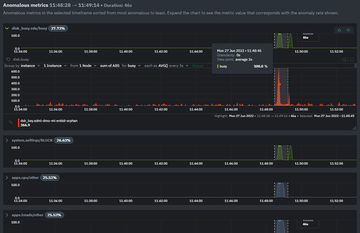
The Anomaly Advisor is the flagship anomaly detection feature within Netdata. In the "Anomalies" tab of Netdata you will see an overall "Anomaly Rate" chart that aggregates node level anomaly rate for all nodes in a space. The aim of this chart is to make it easy to quickly spot periods of time where the overall "node anomaly rate" is elevated in some unusual way and for what node or nodes this relates to.
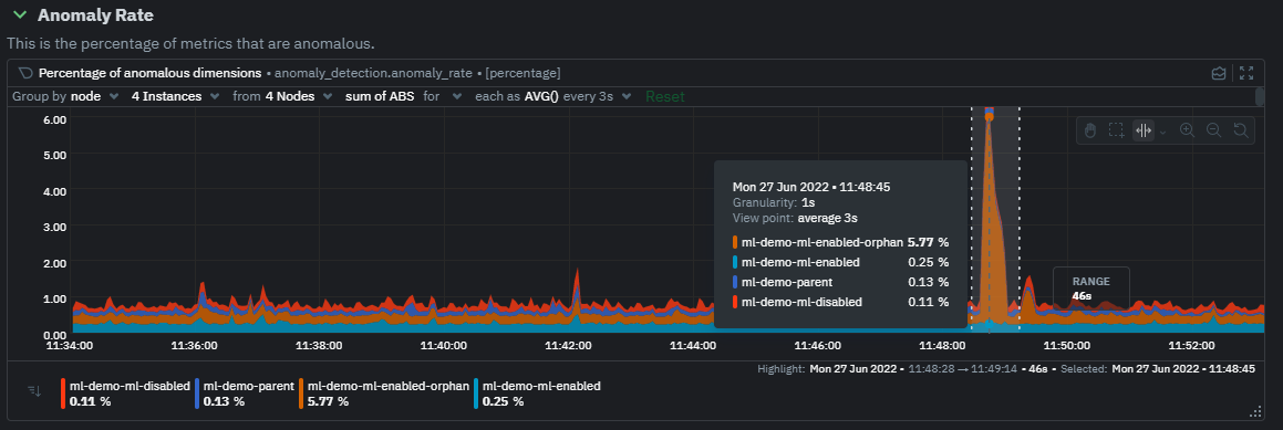
Once an area on the Anomaly Rate chart is highlighted netdata will append a "heatmap" to the bottom of the screen that shows which metrics were more anomalous in the highlighted timeframe. Each row in the heatmap consists of an anomaly rate sparkline graph that can be expanded to reveal the raw underlying metric chart for that dimension.
Embedded Anomaly Rate Charts
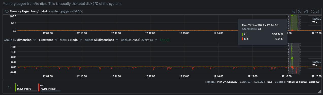
Charts in both the Metrics tab and single node tabs also expose the underlying anomaly rates for each dimension so users can easily see if the raw metrics are considered anomalous or not by Netdata.
Pressing the anomalies icon (next to the information icon in the chart header) will expand the anomaly rate chart to make it easy to see how the anomaly rate for any individual dimension corresponds to the raw underlying data. In the example below we can see that the spike in system.pgpgio|in corresponded in the anomaly rate for that dimension jumping to 100% for a small period of time until the spike passed.
Anomaly Rate Based Alerts
It is possible to use the anomaly-bit when defining traditional Alerts within netdata. The anomaly-bit is just another options parameter that can be passed as part of an alert line lookup.
You can see some example ML based alert configurations below:
- Anomaly rate based CPU dimensions alert
- Anomaly rate based CPU chart alert
- Anomaly rate based node level alert
- More examples in the
/health/health.d/ml.conffile that ships with the agent.
Learn More
Check out the resources below to learn more about how Netdata is approaching ML:
- Agent ML documentation.
- Anomaly Advisor documentation.
- Metric Correlations documentation.
- Anomaly Advisor launch blog post.
- Netdata Approach to ML blog post.
areal/mlrelated GitHub Discussions.- Netdata Machine Learning Meetup deck and YouTube recording.
- Netdata Anomaly Advisor YouTube Playlist.